After more than a year of consulting amongst NMU staff members, students and athletic department, the university plans to unveil new academic and athletics logos on April 6.
The academic tree-and-wave logo and the athletic Wildcat head will be removed from all displays across the university come fall.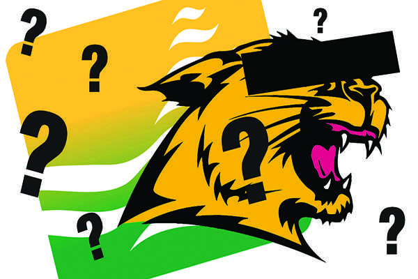
Derek Hall, assistant vice president of university marketing and communications, said the academic and athletic logos have different approaches to their changes.
“When considering the logos we’ve been using the last 20 years, we have a lot of problems producing it,” Hall said. “The trees and waves logo cannot be found in the bookstore and people haven’t gravitated to it. It’s very dated, and we were in desperate need of an update.
“With the Wildcat, there’s a lot of equity in it, and we wanted to build on it. The Wildcat will be an update, while the academic logo is a replacement.”
The logos have seen numerous changes throughout NMU’s 117-year history, most recently in the late 1980s. While no formal record has been kept on the changes, the Superior Dome offers showcases of the many logos that have represented the university.
Hall said the academic logo will have a sense of the traditional “N” found in early designs of the NMU logo.
“The one thing we realized throughout our surveys was how much the ‘N’ meant to the history of the school,” Hall said. “We received great feedback on implementing it back into our new logos, and it’s a nod to our history.”
With both designs, NMU worked through Rickabaugh Design out of Gahanna, Ohio. Hall noted that out of the seven companies NMU reached out to with interest in reconstructing the university’s images, Rickabaugh stood out amongst the others because of the company’s history of working with institutions of higher education.
Eric Rickabaugh, the head of Rickabaugh Design, said the new logos represent the future of NMU.
“It was clear both logos needed an upgrade to represent the university,” Rickabaugh said. “NMU has a lot of innovations happening toward the future, and unfortunately the current logos didn’t do the school justice.
“The trees and waves were dated and focused too much on location rather than proud academics. That warranted the change, and even though it could be difficult at times, it was well-needed.”
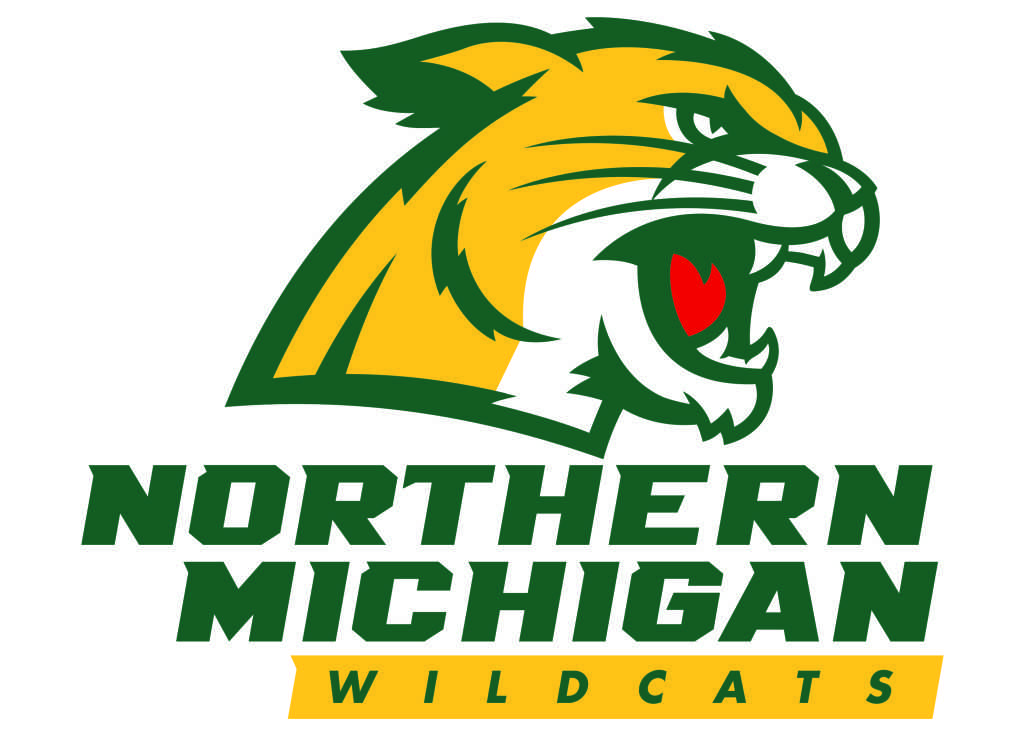
With the athletic logo, the Wildcat will be rebranded with less details, and is inspired by a real breed of cat, as opposed to a generic Wildcat.
“We have worked with a number of schools that have Wildcat mascots, and the nice thing about the nickname is it gives you latitude,” Rickabaugh said. “A Wildcat can be anything from a bobcat to a cougar, and we focused on a design to a more realistic cat. At NMU, there has always been a decision to make the cat more of a cougar-mountain lion, and I think it’s a great decision.”
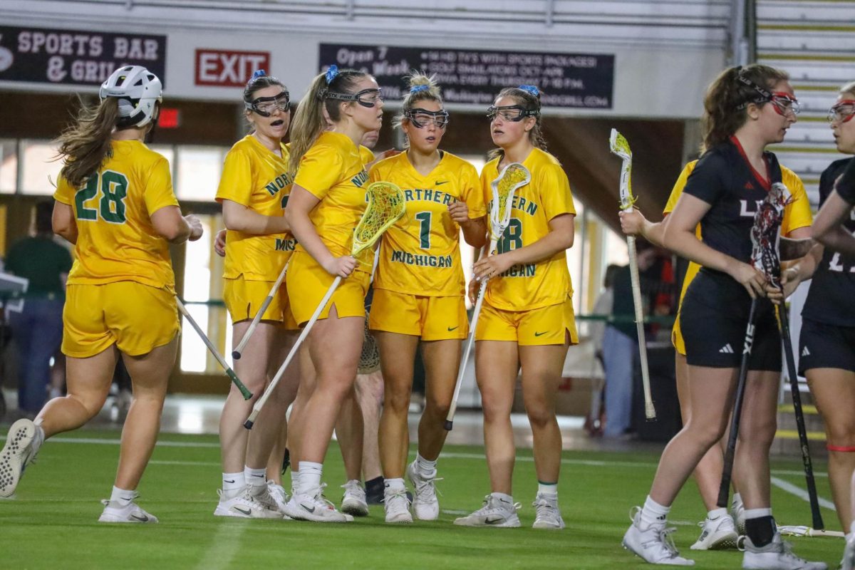
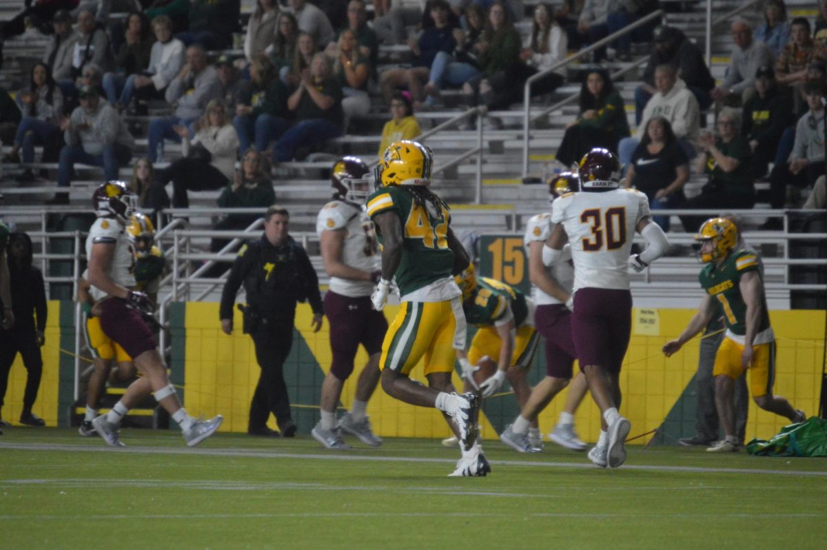
The athletic logo change will lead to a change in uniforms for many of the teams as well.
The logo facelift is a part of a rebranding phase the university began in 2014. After a series of updates from the school’s website to its slogan, the logo change is the final step of the process.
Michigan Tech coincidentally has begun the same rebranding process and chose to change their logos as their first step. They were released in February and earlier this month.
Hall said the new logos will be on campus by August, and the university bookstore will carry merchandise with the new logo as soon as the Board of Trustees officially approves them on April 6.











Cathryn Battice • Mar 17, 2016 at 12:32 am
I don’t recall a survey for alumni to make these changes. Did I miss it?