It’s a new day to be a Wildcat as the university unveils new academic and athletic logos to change the face of NMU.
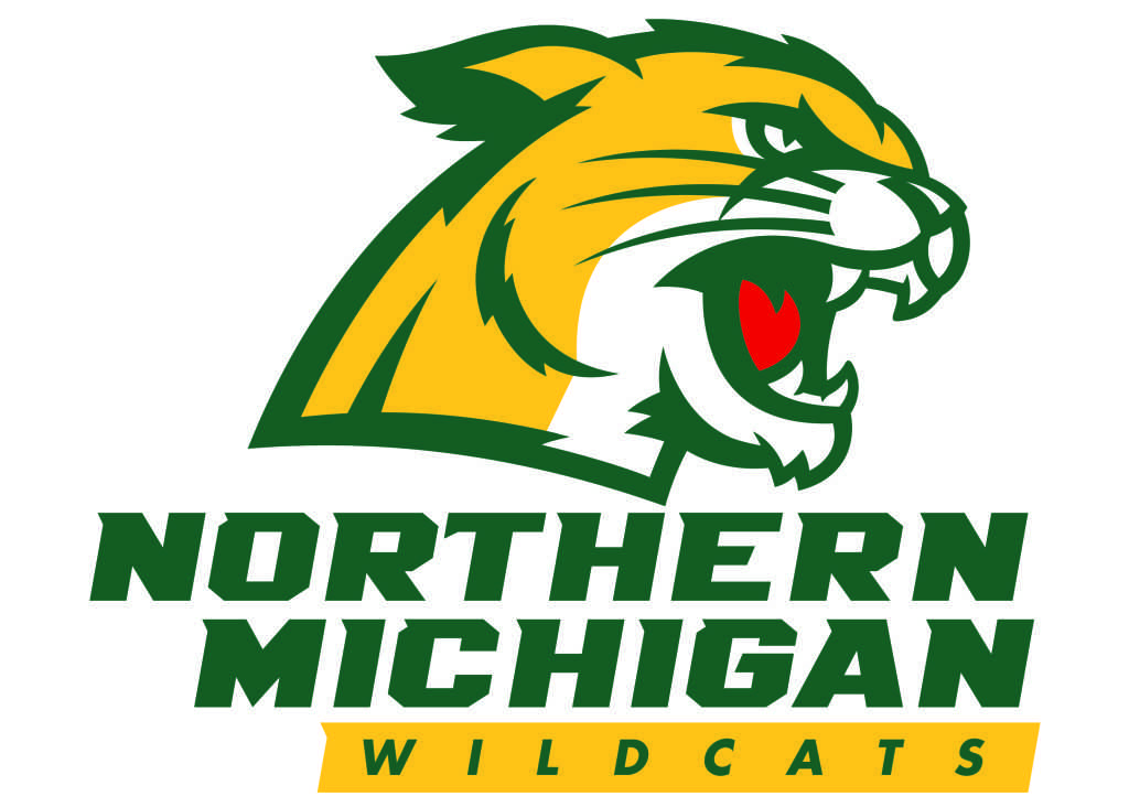
Pending today’s approval by the NMU Board of Trustees, the university will eliminate all formerWildcat and tree-and-wave logos come summer as part of a rebranding effort started a year-and-a-half ago.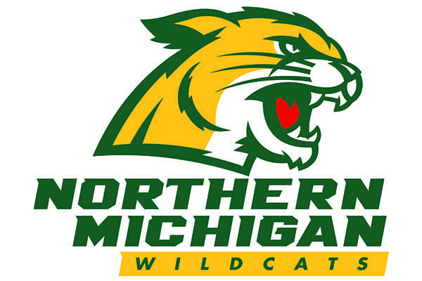
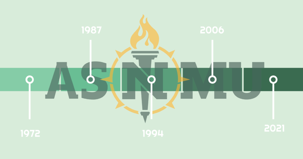
The academic logo has been completely replaced, instead featuring the NMU ‘N’ on top of a torch in a compass. The Wildcat head has seen an upgrade to a less-detailed version with more color variety.
“The (logos) help us better communicate the many great things about Northern and also allow us to give a nod to the history of the university,” NMU assistant vice president for university marketing and communications, Derek Hall said in a press release. “The torch and ‘N’ have been used to represent the institution for more than 50 years. Additionally, the Wildcat logo is well-loved and through feedback, we discovered that an update was the best approach. Raising the bar on the visual elements that define Northern will help elevate the university’s profile and help market it to prospective students.”
Art director and graphic designer Mike Forester has been a driving force in the rebranding of the new logos and has been in support of a change since joining NMU in 2005.
“When we’ve tried to tell people in the past about how NMU is, we just didn’t have the material and the looks,” Forester said. “We needed this and never had it, so it’s a decade-long frustration I’m putting to bed. We’re getting the representation the school deserves.”
NMU worked with Rickabaugh Graphics out of Gahanna, Ohio to design the university’s new brand.
The cost to design both logos came to an estimated $35,000 before printing costs.
“With this we developed a brand new logo, updated one logo and created a brand. It’s a package deal. I think we got a good deal on it, and a lot of it pays for an expert to ome in and listen to us to create something that relates to this school.
“People ask why we didn’t do it ourselves at a cheaper cost, but that would have been one person’s idea instead of a full representation of an entire community.”
NMU Athletic Director Forrest Karr said the new logo brings a revamp the university.
“There is a tremendous sense of pride and commitment to the Wildcat logo,” Karr said. “The plan from the start was to maintain the previous logo’s strengths and to create something similar with cleaned-up lines. We never wavered from that. Our goal was to bring new energy, to take what makes us who we are, and modernize it, allowing the image to show up better on everything from apparel to mobile devices.”
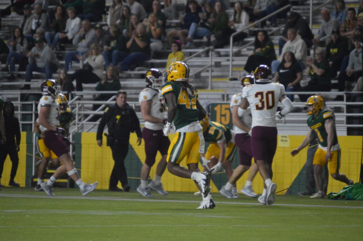
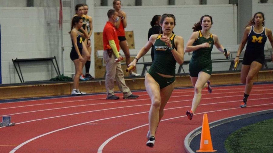
As the university implements the now logos, the earliest changes will come to athletics through updated uniforms and displays in sports venues on campus.
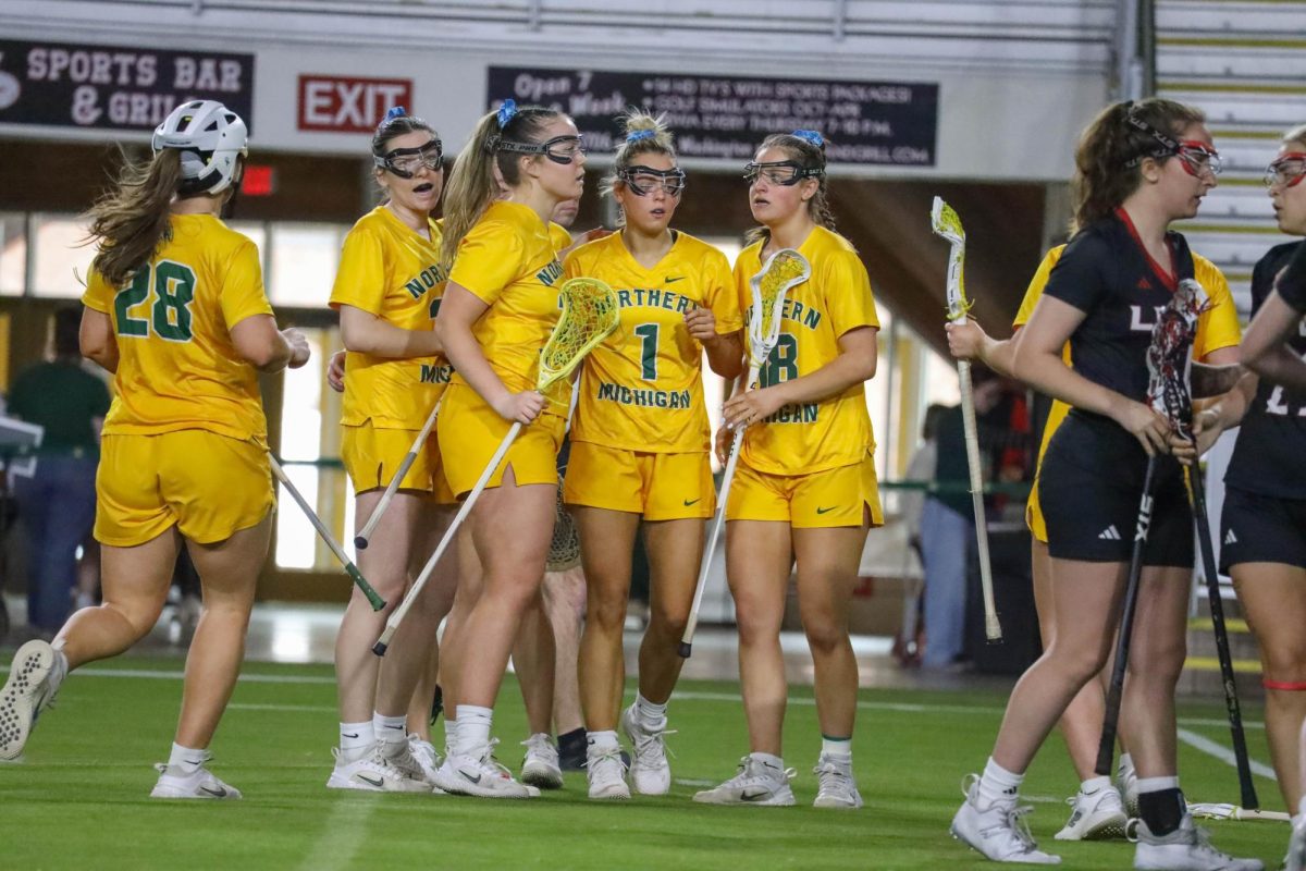
New teams joining NMU such as women’s lacrosse and men’s soccer will have the new logos on their jerseys.The football team will also embrace the new Wildcat on its helmets when the
season kicks off in September.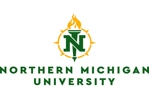
Nearly all teams operate on a two-year cycle for jersey updates, meaning teams in the midst of the cycle such as hockey and basketball will need to wait at least one season for an update.
“Jerseys cost a fair amount, and everybody has a budget,” Forester said. “We don’t want to submarine anybody and exceed their budget. We’re exploring opportunities such as alternate jerseys for the hockey team to recreate their image in the meantime.”
In the past, coaches would be left to redesign new jerseys on their own, but Forester will be working hand-and-hand with coaches and players to create jerseys they feel best represents their programs.
NMU football head coach Chris Ostrowsky said the athletic logo represents the university’s dedication to athletics.
“The administration has done an amazing job,” Ostrowsky said. “They didn’t just throw darts and hope it looks good. They put a lot of time and work into this and made sure it fits. Whenever you have something new it’s really exciting. It excites the guys and the people with the new uniforms. Today, athletes want to be stimulated, and this will certainly generate interest.”
The nearly three-decade old Wildcat head can be found on nearly all surfaces of campus sports facilities like the Superior Dome, the PEIF and the Berry Events Center. Hall said facilities that do not see much action during the summer such as the Berry will experience the first transformations this summer.
A new line of NMU merchandise is expected to turnover the bookstore in the coming months.
Forester said the new logos maintain the iconic symbols that represent NMU with an updated touch for the next generation.
“When people see the difference, it could be hard if you’ve been ingrained with the past,” Forester said. “When you really take a look at it and understand the changes, you see there’s not a ton of difference but it’s more modernized. We didn’t throw away everything people love about NMU, it’s just caught up to date with 2016. It’s a historical time for the university.”
Out with the old, in with the new
April 6, 2016
Story continues below advertisement
0
Tags:
More to Discover

